NYC Broadway Week
Identity redesign for NYC Broadway Week, a biannual 2-for-1 ticket sale in Manhattan’s Theatre District. Created while working in-house at NYC & Company.

Identity redesign for NYC Broadway Week, a biannual 2-for-1 ticket sale in Manhattan’s Theatre District. Created while working in-house at NYC & Company.

Broadway Week is essentially a twofer special. Theater fans from all over the globe wait for this ticketing event and hop online to snag half-off tickets for otherwise impossibly expensive top-tier shows.
It’s a moment of celebration and fun, especially enjoyed by locals and day-trippers.
Broadway Week is essentially a twofer special. Theater fans from all over the globe wait for this ticketing event and hop online to snag half-off tickets for otherwise impossibly expensive top-tier shows.
It’s a moment of celebration and fun, especially enjoyed by locals and day-trippers.

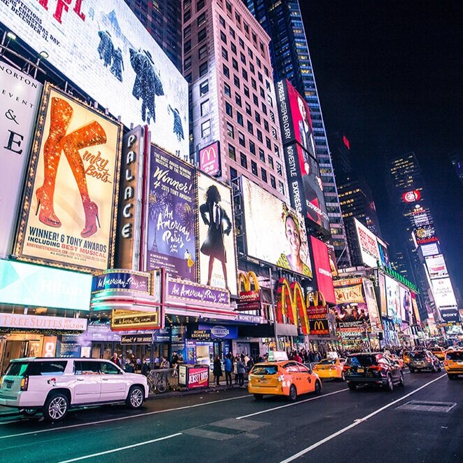
By my estimation, the existing Broadway Week identity left something to be desired. When viewing the previous work (shown above) I didn’t get that feeling of excitement, celebration, even kitsch-factor that a night on Broadway entailed.
I couldn’t see any deeper meaning beyond, perhaps, an homage to the glittering lights. Likely this was the product of an overworked staff working with limited time and resources.
By my estimation, the existing Broadway Week identity left something to be desired. When viewing the previous work, I didn’t get that feeling of excitement, celebration, even kitsch-factor that a night on Broadway entailed.
I couldn’t see any deeper meaning beyond, perhaps, an homage to the glittering lights. Likely this was the product of an overworked staff working with limited time and resources.

Overall, I felt the identity needed a bit more humanity to it. A Broadway show is human-to-human storytelling, something we’ve been doing ever since we were living in caves and describing a great hunt.
In a world of bite-sized, digitized entertainment, Broadway is a welcome throwback to in-person storytelling, evolved to its highest from.
Overall, I felt the identity needed a bit more humanity to it. A Broadway show is human-to-human storytelling, something we’ve been doing ever since we were living in caves and describing a great hunt. In a world of bite-sized, digitized entertainment, Broadway is a welcome throwback to in-person storytelling, evolved to its highest from.

In my design research, I examined collage art (insert creative director eye-roll here) and constructivism. There is something wonderfully tactile and absolutely honest about this sort of design language.
I wanted to evoke that same ethos in my redesign of Broadway Week.
In my design research, I examined collage (I know, I know, insert creative director eyeroll here) and constructivism. There is something wonderfully tactile and absolutely honest about this sort of design language.
I wanted to evoke that same ethos in my redesign of Broadway Week.


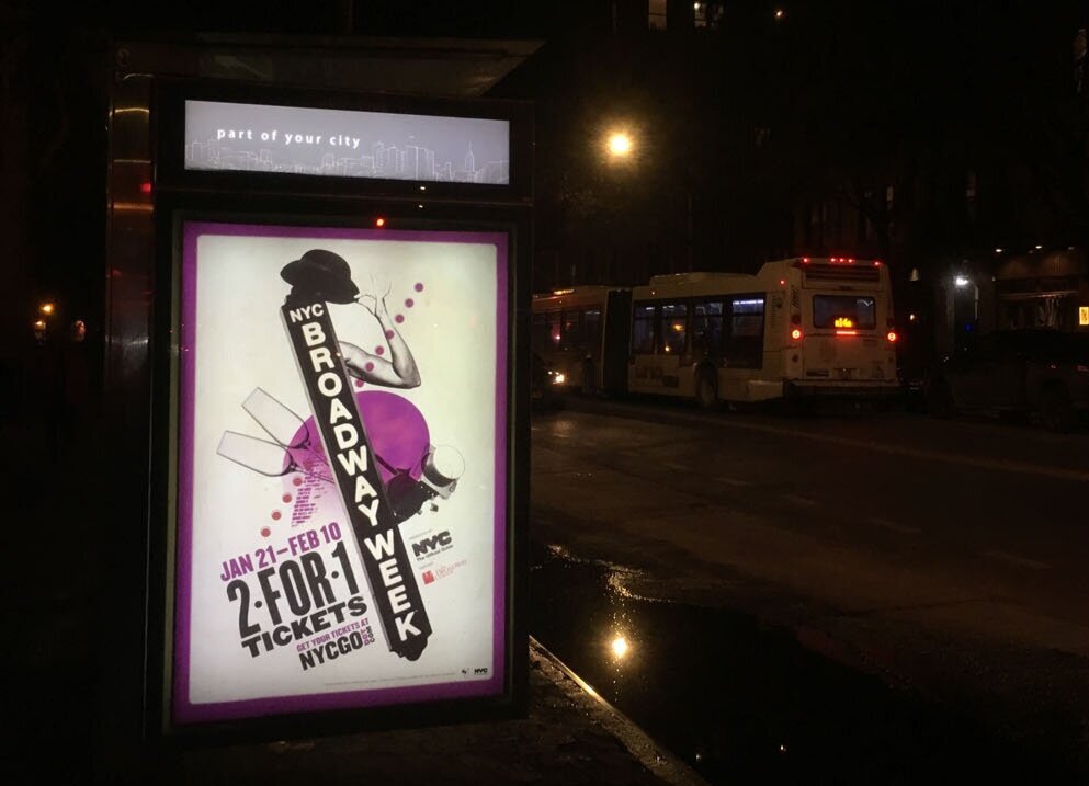
The creative is meant to be an eye-grabbing, to-the-point representation of all the Broadway signifies. It’s fun, it’s tactile, and it’s a little bit weird.
I employed the lines and circles of the Constructivist design to create a focal point the average view on the street might lock into. From there, I used high-impact typography and a few key visuals elements, especially the tell-tale dancer’s arm and fosse hat, to drive home the message.
In order to announce this special event, a media plan is put in place by the marketing professionals at NYC & Company.
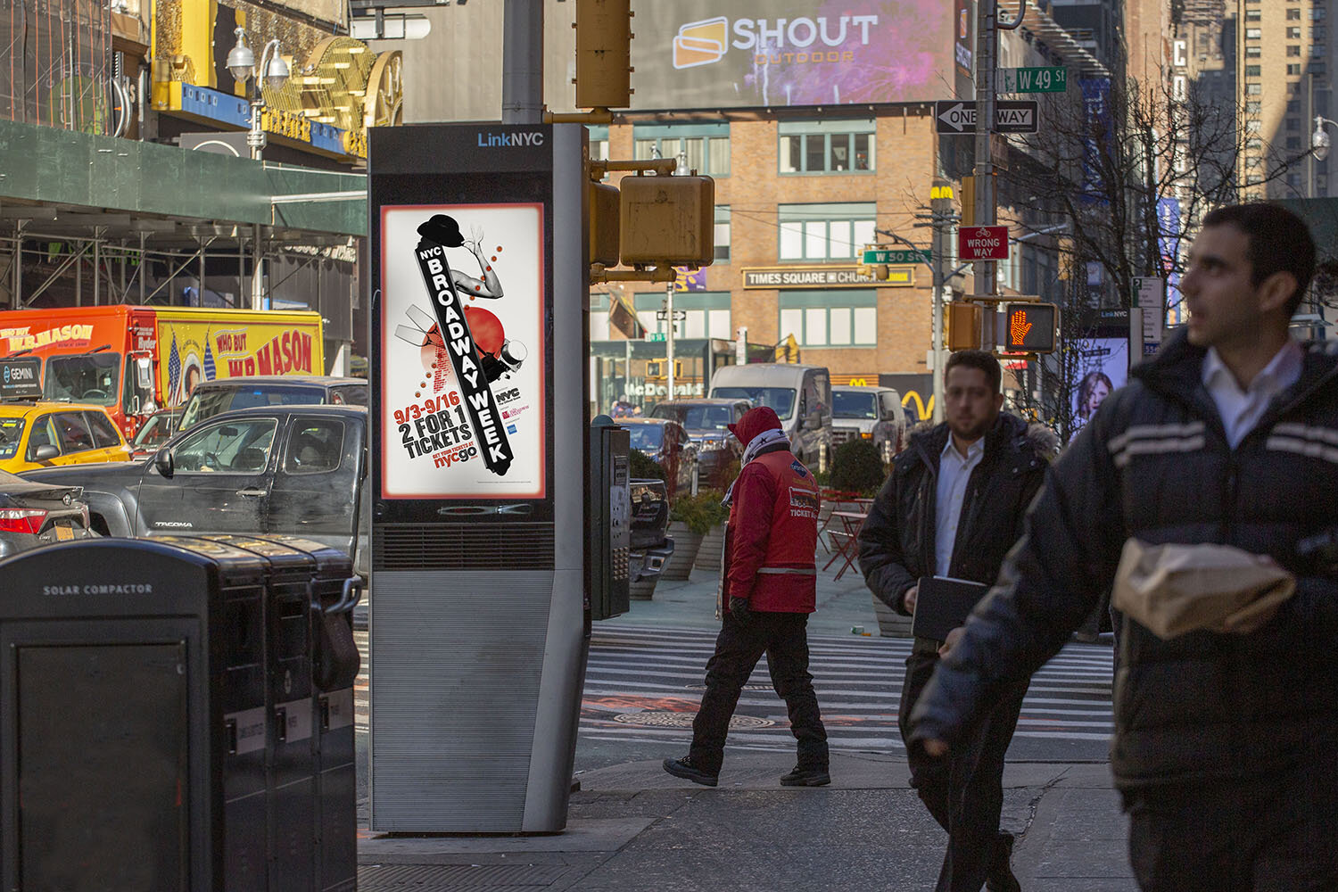
For locals, ads are most visibly seen as out of home advertising on bus shelters, newsstands, and LinkNYC screens.


A rewarding part of the job is stumbling across your work in the wild, especially out on the streets of New York.
Shown on this page are two different color executions, which represent two different seasons, about 4 months apart.
🟧= Fall season.
🟪= Winter season.

This is a LinkNYC screen execution.
Though the print posters are more permanent, the design always look the best on these digital screens.

You know, the ones that everyone turns off as soon as they climb in the back?
Hopefully a few unwitting tourists watched them with full audio.

This is the video, in blue for the 2019 Fall season.
I created boards for it, then art directed a few photo shoots and created all the assets before handing it off to the animation team.
This was a really fun project, as we did photo shoots with NYC & Company staff members to get the silhouetted eyes, ears, arms, etc.
Talk about a great way to meet some of your co-workers.
“Excuse me, I couldn’t help but notice you have perfectly-shaped ears…”
Overall, the revamp was a success.
The marketing team at NYC & Company shared
with me these exciting numbers:
total revenue for 24 shows
from our previous record of $9mm
in Winter 2016 with 26 shows
average revenue per show
from Winter 2016

And, of course, we did have a digital plan, including web banner, social stories, and IGTV.
I’ll spare you web banners, but here’s an animated email I created to help users figure out how to use the NYCGO website to book tickets, as well as an IG Story ad.